I felt like reading chapters 10 and 11 validated some of the lessons that I began to learn over the course of working on the midterm. At the start of the project, my code was deeply disorganized. I was thinking of the whole project as one still image and not thinking more seriously about how to make the individual components work best. That said, as I continued working, I began to see the importance of organizing my code, which is underlined in chapter 10. I created way too many classes as a means of keeping my code clean, which is not quite what the book meant, but is along the same lines. If I had read the chapters before my project, I would’ve thought more about the individual components of the matchmaker, and I would have thought to do things like create a loop for lines instead of drawing 40 individual lines.
Author: Lia Hagen
Midterm Week 2
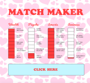
For my midterm assignment, I made a “Match Maker” game. I modeled it after those old Love Tester / Match Maker games that you still see in some bars. I knew I wanted the project to look super cheesy and silly, so I used a background made of a million hearts. I also wrote (mostly joking) levels for each of the bars.
My sketch has 4 classes: Bars (to draw the bars), Day (randomly named, contains all text), Lines (contains all the lines), and Rectangles (creates rectangles of random height inside the bars). At first, I didn’t understand classes, and my code was way too long to use comfortably. Once I got the hang of them, my code became easier to read and edit.
The responsiveness here is fairly simple. When you click the button, rectangles of random heights are generated inside each bar. I also added a second element just for fun — you can sort of cheat your results. When you click inside one of the bars, it creates a new red rectangle exactly the size of one of the sections. You can fill your bar up all the way if you, like me, aren’t satisfied with your results.
This project turned out pretty much exactly how I wanted it to, with the one exception being my difficulties uploading it to Openprocessing.
Midterm Week 1
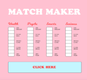
Over the next two weeks, I want to create a funny “Match Maker” machine. These love testers/match making machines can be found in dive bars and failed arcades across America, and I want to make a digital version. The final piece will have four bars, and they will each rise when you press a button. Because this will obviously be a joke version of the traditional machine, I will write funny descriptions for each level of the bar. I also want to create little animations that move around the machine, similar to the ones on the video I’ve shared. I tried to start them early, but I couldn’t figure out how to make hearts on Processing even after searching the web. As far as the aesthetics of the machine go, I went for as pink as possible. I have an irrepressible fondness for pastels, so I also included a light blue. As the project continues, I want to play up the campiness and make it as ridiculous as possible.
I will use click-based responsiveness and randomization to make the bars rise. I also want to have an effect when the button is pressed, but I’m not sure what that effect will be. I will have to continue teaching myself how to work with classes in order to complete this project. I will also have to teach myself how to make hearts, because having a matchmaker without hearts is frankly a sad, sad prospect.
Week 2 — Interactive
Hi!
I know this was supposed to be a partner assignment, but I emailed 5 different people from class and could not find a partner. Instead, I did it myself!
The most challenging part of this assignment was honestly just learning how to do it. I watched many hours of YouTube tutorials, including but not limited to the ones you linked us to. I still couldn’t figure out how to get objects to move in reaction to each other. That was a bigger problem in the face assignment, when I tried to make pupils move around the eye and ended up having them roam around the entire background.
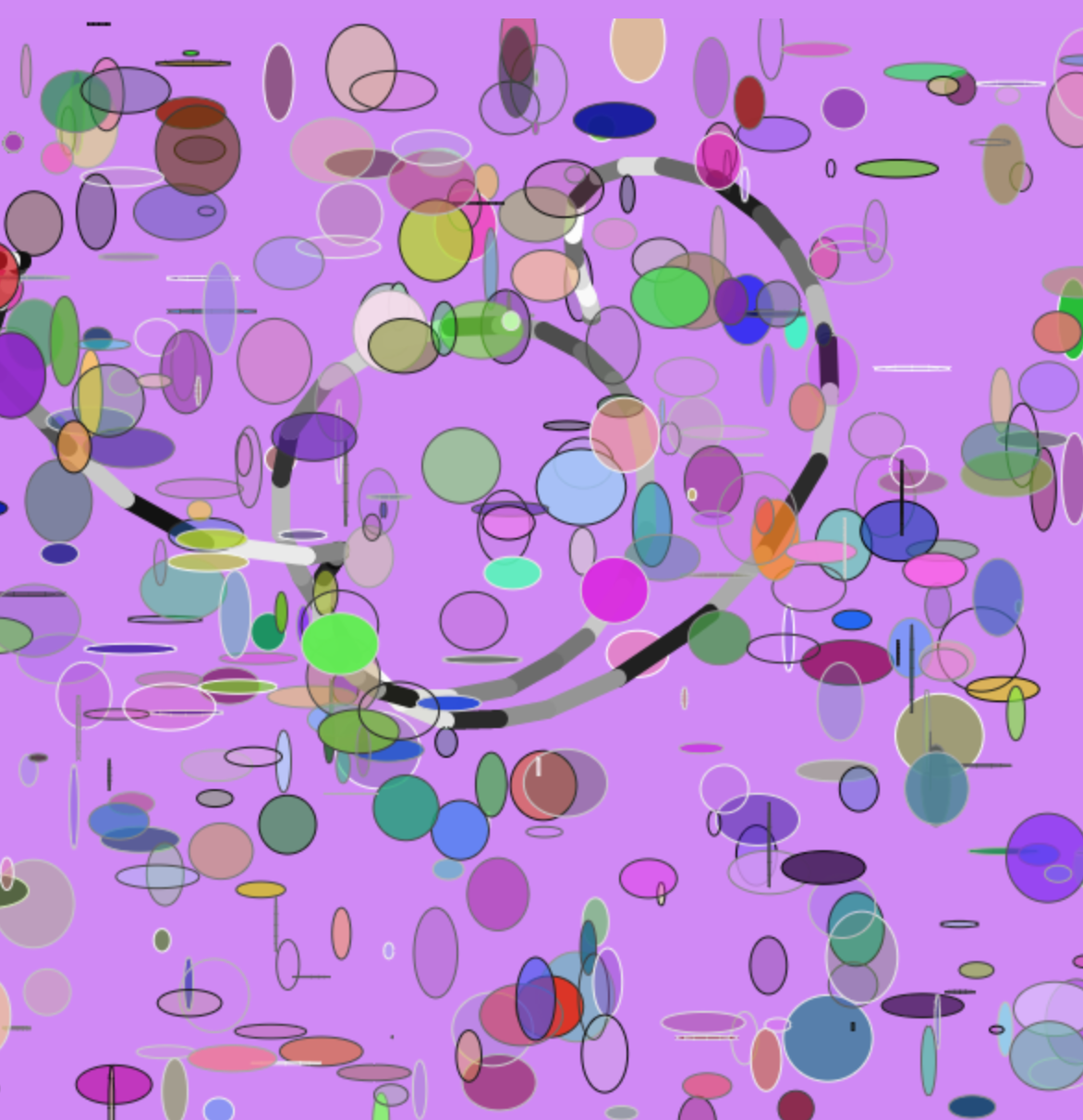
Unlike the other two assignments, it was hard for me to come up with a concrete vision for this sketch. I ended up thinking about randomized color. I’m a huge fan of using color to tell a visual story, and there was something interesting to me about a completely randomized color palette. I’m not super happy with how it turned out, but it was an interesting process.
You draw by moving your mouse around, and the stroke picks random shades between 0-255. Random ellipses are generated constantly, with random colors and strokes. And every time you click, the background becomes a new color.
https://www.openprocessing.org/sketch/506762
Self Portrait — Day at the Beach!
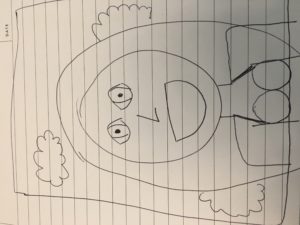
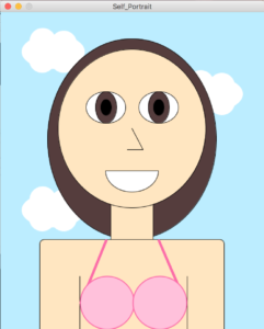
The most challenging thing about this assignment was learning to think in terms of basic shapes. When I was planning the portrait, I had to think of the body in terms of its most basic components. I tried to focus on rectangles and ellipses, as those were the easiest to code. The head is almost all made of circles, with a few lines. I thought the clouds would be very difficult, but they actually didn’t take me very long. They were the last things I did, and so I’d gotten a hang of how to use the program. I made a series of small ellipses with no strokes and combined them into clouds. The actual hardest part of the project was figuring out the arc.
The one thing I couldn’t master was bangs. I have kind of weird, swoopy bangs, and I could not figure out how to code them. I tried using an arc, but I didn’t know how to rotate it. Nor did I know how to put a stroke only on one part of the arc.
Ultimately, I’m happy with how it turned out!
You can find it here: https://www.openprocessing.org/sketch/504627

